Mobile devices account for more than half of all internet traffic worldwide. Your business needs an adaptive website design if you want to expand. We give your business a beautiful, responsive website that attracts visitors and converts them into leads and sales with our responsive web design services.
Responsive web design services ensure the adaptive behavior of a web solution to the screen size on which it is displayed. Following a mobile-first strategy, ScienceSoft translates the functionality of your web solutions into intuitive, smoothly functioning, and highly transformative digital experiences.
Our responsive website design services can help you develop incredibly responsive and efficient websites regardless of device or screen size. Whether it’s an e-commerce store, a corporate website, or a dynamic web application, we create every aspect of design to engage users, improve conversion rates, and strengthen your brand identity.
Our Responsive Website Design Services Offerings
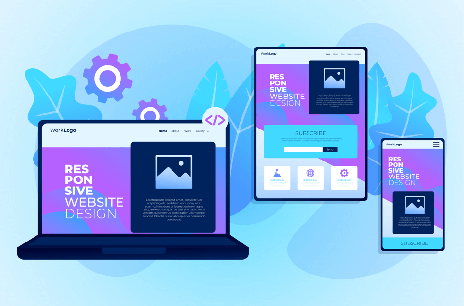
Responsive Website Design
Responsive website design refers to the approach of designing and developing websites in a way that ensures optimal viewing and interaction experiences across a wide range of devices and screen sizes. This includes desktop computers, laptops, tablets, and smartphones.
Key principles of responsive design include:
Fluid grids: Designing layouts using relative units such as percentages rather than fixed units like pixels, allowing content to adapt and resize based on the user’s screen size.
Flexible images and media: Using CSS to ensure images, videos, and other media elements scale appropriately within their containers, preventing them from overflowing or becoming distorted on different devices.
Media queries: Implementing CSS media queries to apply specific styles based on factors like screen width, device orientation, and resolution. This allows for targeted adjustments to layout, typography, and other design elements.
Mobile-first approach: Starting the design process with a focus on mobile devices and progressively enhancing the layout for larger screens. This ensures a streamlined experience for users on smaller devices while still providing a rich experience on desktops and tablets.
Accessibility considerations: Ensuring that the website is accessible to users with disabilities by implementing features such as keyboard navigation, proper semantic HTML markup, and contrast ratios that meet accessibility standards.
Responsive Ecommerce Web Design
Responsive e-commerce web design refers to the creation of online stores that adapt and adjust their layout and functionality based on the device and screen size being used by the visitor. In today’s digital landscape, where consumers access websites through various devices such as desktop computers, laptops, tablets, and smartphones, it’s crucial for e-commerce websites to be responsive.
Here are some key aspects of responsive e-commerce web design:
Flexible Layouts: Responsive design involves using fluid grids and flexible layouts that can adjust to different screen sizes. This ensures that the website’s content remains readable and accessible across various devices.
Media Queries: Media queries are CSS techniques used to apply different styles based on the characteristics of the device, such as screen width, resolution, and orientation. By utilizing media queries, designers can create responsive designs that adapt to different devices seamlessly.
Mobile-First Approach: With the increasing prevalence of mobile devices, many designers adopt a mobile-first approach to e-commerce web design. This involves designing the mobile version of the website first and then scaling up the design for larger screens. This ensures that the website delivers a great user experience on smaller screens, which are often more limited in terms of space and functionality.
Optimized Images: Images play a significant role in ecommerce websites, but they can also slow down page load times, especially on mobile devices with slower internet connections. To ensure a smooth user experience, designers should optimize images for web use, using techniques such as compression and lazy loading.
Touch-Friendly Navigation: Mobile devices rely on touch-based interactions, so ecommerce websites should have touch-friendly navigation elements such as large buttons and easy-to-use menus. This makes it easier for users to browse products and complete purchases on touchscreen devices.
Fast Loading Speed: Page load speed is crucial for ecommerce websites, as slow loading times can lead to higher bounce rates and decreased sales. Designers should optimize website performance by minimizing HTTP requests, using browser caching, and employing other speed optimization techniques.
Cross-Browser Compatibility: E-commerce websites should be compatible with all major web browsers, including Chrome, Firefox, Safari, and Edge, to ensure a consistent user experience across different platforms.
User Testing: Once the responsive e-commerce website is developed, it’s essential to conduct thorough testing across various devices and screen sizes to identify any issues or inconsistencies. User testing helps ensure that the website delivers a seamless experience for all visitors, regardless of the device they’re using.
Web Design Optimization
Web design optimization refers to the process of improving various aspects of a website to enhance its performance, and user experience, and achieve specific goals such as increased traffic, conversions, or engagement. Optimization involves tweaking elements like layout, content, functionality, and technical aspects to make the website more efficient, user-friendly, and appealing to visitors.
Here are some key areas to focus on for web design optimization:
Responsive Design: Ensure that your website is mobile-friendly and adapts seamlessly to various screen sizes and devices. This is crucial as more users access the internet through smartphones and tablets.
Page Load Speed: Optimize the loading time of your web pages to reduce bounce rates and improve user experience. This can involve compressing images, minifying code, using browser caching, and optimizing server response times.
Clear Navigation: Design intuitive navigation menus and site structure to help users find information easily and quickly. Use descriptive labels and logical hierarchies to guide visitors through your website.
Content Optimization: Create high-quality, relevant, and engaging content that resonates with your target audience. Use headings, bullet points, and visuals to break up text and improve readability. Incorporate keywords strategically for SEO purposes.
Visual Appeal: Use attractive and cohesive design elements such as colors, fonts, images, and videos to enhance the visual appeal of your website. Maintain consistency across pages to reinforce your brand identity.
Call-to-Action (CTA): Place clear and compelling CTAs strategically throughout your website to encourage desired actions from visitors, whether it’s making a purchase, signing up for a newsletter, or contacting your business.
Optimized Forms: Streamline and optimize forms to minimize friction and increase conversions. Use progressive profiling, pre-filled fields, and clear instructions to make the form-filling process as smooth as possible.
SEO Optimization: Implement on-page and off-page SEO techniques to improve your website’s visibility in search engine results. This includes optimizing meta tags, URLs, headings, and internal linking, as well as building quality backlinks from reputable websites.
Accessibility: Ensure that your website is accessible to all users, including those with disabilities. Follow web accessibility guidelines such as WCAG (Web Content Accessibility Guidelines) to make your site more inclusive and compliant with legal requirements.
Performance Monitoring and Testing: Continuously monitor and analyze website performance using tools like Google Analytics and Heatmaps. Conduct A/B testing to experiment with different design elements and strategies to identify what works best for your audience.
Website Content Migration
Turing, a top provider of responsive website design services, provides dependable and effective website content migration services to guarantee a smooth transfer to a new website. Our website content migration services are made to assist you avoid data loss and transferring your content to a new platform without affecting your search engine optimization (SEO).
Our specialists carry out a thorough examination of your present website and create a strategy for the smooth transfer of content to the new one. We carry out a quality check after migration to guarantee that all migrated content is correct and operational. Additionally, we make sure the website is mobile-friendly and responsive to offer a seamless user experience on all devices.
WordPress Website Development
Our team of responsive website designers creates scalable, aesthetically pleasing WordPress websites by utilizing industry best practices and the newest technologies. Our expertise lies in crafting WordPress websites that are precisely designed to fulfill your demands.
To build a unique website development strategy that will satisfy your company’s demands, we start with a consultation to learn about your website’s goals, target audience, and business objectives. We offer the following WordPress website development services:
1] Transforming your design files into a fully functional WordPress website that meets your design specifications and branding requirements.
2] Creating a customized WordPress theme meets your requirements and provides a seamless user experience.
Why Responsive Web Design Services Matters
Improved User Experience:
With the increasing use of mobile devices to access the internet, responsive design ensures that your website looks and functions well across various screen sizes and devices. Users will have a seamless experience regardless of whether they’re using a smartphone, tablet, laptop, or desktop computer.
Broader Audience Reach:
By optimizing your website for responsiveness, you make it accessible to a wider audience. People who browse the internet on mobile devices are more likely to engage with a website that is easy to navigate and read on their screens. A responsive design ensures that you don’t lose potential visitors due to a poor user experience on mobile devices.
SEO Benefits:
Search engines like Google prioritize mobile-friendly websites in their search results. Having a responsive website can improve your search engine rankings, leading to increased visibility and traffic to your site. Google even labels mobile-friendly websites in search results, potentially attracting more clicks from users.
Cost-Effectiveness:
In the past, businesses often created separate mobile versions of their websites. However, maintaining multiple versions of a site can be costly and time-consuming. Responsive web design eliminates the need for separate mobile sites, saving resources in the long run.
Consistent Branding:
A responsive design ensures that your brand’s look and feel remain consistent across all devices. This consistency helps in building brand recognition and trust among users, regardless of the device they use to access your website.
Adaptability to Future Devices:
With the rapid advancement of technology, new devices with varying screen sizes and resolutions are constantly emerging. Responsive design allows your website to adapt seamlessly to these new devices without requiring significant redesign or development efforts.
Better Conversion Rates:
A user-friendly experience leads to higher conversion rates. Whether your goal is to generate leads, make sales, or encourage users to take specific actions, a responsive website ensures that visitors can easily navigate your site and complete desired tasks, leading to improved conversion rates.
FAQs
1. What is responsive web design?
Responsive web design is an approach to building websites that ensures optimal viewing and interaction across a wide range of devices and screen sizes. It involves designing and coding a website to adapt and respond smoothly to the user’s behavior and environment based on factors such as screen size, platform, and orientation.
2. Why is responsive web design important?
Responsive web design is crucial because it ensures that your website looks and functions well on all devices, from desktop computers to smartphones and tablets. With the increasing use of mobile devices for browsing the internet, responsive design helps provide a seamless user experience, improves accessibility, and enhances search engine optimization (SEO).
3. What are responsive web design services?
Responsive web design services refer to professional services offered by web designers and developers to create or optimize websites using responsive design principles. These services may include website audits, design mockups, coding, testing, and ongoing maintenance to ensure the website remains responsive and up-to-date.
4. How do responsive web design services benefit businesses?
Responsive web design services help businesses reach a wider audience by ensuring their website is accessible and user-friendly on all devices. This can lead to increased traffic, higher conversion rates, improved user engagement, and ultimately, better business results. Additionally, responsive design can save time and resources by eliminating the need to create separate websites or apps for different devices.
5. What is a responsive web design tester?
A responsive web design tester is a tool or software application used by web designers and developers to preview and evaluate how a website appears and functions across various devices and screen sizes. These testers often simulate different viewport sizes and device orientations, allowing designers to identify and address any issues related to responsiveness before launching the website.