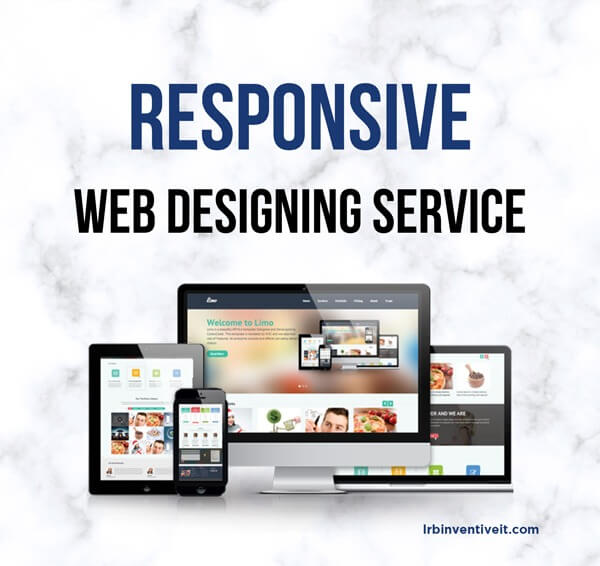
In today’s digital age, having a responsive website is not just an option, but a necessity. With the increasing number of users accessing the internet through various devices such as smartphones, tablets, and desktops, businesses must ensure that their websites adapt seamlessly to different screen sizes and resolutions. That’s where responsive web design comes in.
At MK Responsive Web Design Services, we specialize in creating websites that are not only visually stunning but also highly responsive. Whether your visitors are browsing on a smartphone, tablet, or desktop, our websites provide an optimal viewing experience, ensuring maximum engagement and conversion for your online business.
What Is A Responsive Web Design?
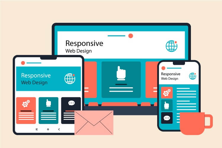
Responsive web design is a dynamic approach to building websites that ensures optimal viewing and interaction experiences across a wide range of devices and screen sizes. Unlike traditional web design, which often involves creating separate versions of a website for different devices, responsive design utilizes a single codebase that automatically adjusts layout, content, and functionality based on the device being used.
One of the key principles of responsive web design is fluidity. Elements within a responsive website are designed to resize and reposition themselves fluidly, ensuring that content remains accessible and visually appealing regardless of screen dimensions. This fluidity is achieved through the use of flexible grids and layouts, as well as media queries that adapt styling based on device characteristics such as screen width and orientation.
Another important aspect of responsive design is the prioritization of content. With limited screen real estate on smaller devices like smartphones, it’s essential to prioritize the most important content and functionality for optimal user experience. Responsive design allows for the rearrangement and stacking of content elements, ensuring that users can easily access key information without unnecessary scrolling or zooming.
In addition to enhancing user experience, responsive web design also offers benefits from an SEO perspective. Search engines like Google prioritize mobile-friendly websites in their search results, meaning that responsive design can improve visibility and rankings for your site. By providing a consistent experience across devices, responsive websites are more likely to attract and retain visitors, ultimately driving better engagement and conversions.
Mobile-Friendly vs. Responsive Websites
Mobile-friendly and responsive websites are both designed to provide an optimal user experience on mobile devices, but they achieve this in different ways.
Mobile-friendly websites are built with a focus on ensuring that they can be easily viewed and navigated on mobile devices. They typically involve creating a separate, simplified version of the website specifically for mobile users. These mobile-friendly versions often feature larger text, simplified navigation menus, and optimized layouts to accommodate smaller screens. While mobile-friendly websites improve the mobile user experience, they may not always offer the same level of functionality or content as the desktop version.
On the other hand, responsive websites use a single codebase that automatically adjusts the layout, content, and functionality of the site based on the device being used. With responsive design, the website responds dynamically to the user’s screen size and orientation, providing an optimal viewing experience across a wide range of devices, including smartphones, tablets, and desktops. Responsive websites offer a more consistent experience across devices and typically require less maintenance compared to maintaining separate mobile-friendly versions.
While both mobile-friendly and responsive websites aim to improve the mobile user experience, responsive design offers several advantages. It provides a more consistent user experience across devices, requires less maintenance, and is favored by search engines like Google, prioritizing mobile-friendly websites in their search results. Ultimately, choosing between a mobile-friendly and responsive design depends on your specific requirements and goals. Still, responsive design is often considered the best practice for creating a seamless multi-device experience.
The Benefits of Custom Responsive Website Design Services
Custom responsive website design services offer numerous benefits for businesses looking to establish a strong online presence and reach their target audience effectively. Here are some of the key advantages:
Optimal User Experience:
Responsive websites adapt seamlessly to various screen sizes and devices, providing an optimal viewing and interaction experience for users. Whether visitors access the site from a desktop, smartphone, or tablet, they will enjoy a consistent and user-friendly interface.
Improved SEO Performance:
Responsive design is favored by search engines like Google. A single responsive website is easier for search engines to crawl and index compared to multiple versions of a site. With better indexing, your website is more likely to rank higher in search engine results, leading to increased visibility and traffic.
Cost-Effectiveness:
While the initial investment in custom responsive web design may be higher compared to using pre-made templates, it offers long-term cost savings. Maintaining a single responsive website is more efficient than managing multiple versions for different devices. Additionally, a well-designed responsive site reduces the need for future redesigns, saving both time and money.
Increased Reach and Accessibility:
With the increasing use of mobile devices, having a responsive website ensures that your content is accessible to a broader audience. Whether users are on smartphones, tablets, laptops, or desktops, they can access your website without any compromise in functionality or user experience.
Enhanced Brand Image:
A well-designed responsive website reflects positively on your brand. It demonstrates your commitment to providing an excellent user experience and staying current with technological trends. A positive user experience can lead to increased customer satisfaction and improved brand loyalty.
Easy Maintenance:
With a responsive website, you only need to maintain and update one version of your site, rather than multiple versions for different devices. This streamlines the maintenance process, saving you time and resources.
Competitive Advantage:
In today’s competitive digital landscape, having a responsive website is no longer optional; it’s essential. By investing in custom responsive website design services, you gain a competitive edge by providing users with a seamless and engaging online experience across all devices.
Why Responsive Web Design Matters
Responsive web design is essential in today’s digital landscape because it ensures that your website looks and functions flawlessly across all devices, including desktops, laptops, tablets, and smartphones. With the increasing use of mobile devices to access the internet, having a responsive website is no longer optional—it’s a necessity.
By providing users with a seamless and consistent experience regardless of the device they’re using, responsive web design helps you reach a wider audience, improve user engagement, and drive conversions. Additionally, responsive design is favored by search engines like Google, which prioritize mobile-friendly websites in their search results, giving you an added advantage in terms of SEO and online visibility.
Some Responsive Web Design Services
here are five responsive web design services that are typically offered by web design agencies:
Custom Responsive Website Design:
Designing and developing a website from scratch that is responsive and optimized for viewing on various devices such as desktops, laptops, tablets, and smartphones.
Responsive Website Redesign:
Updating an existing website to make it responsive. This involves modifying the site’s code, layout, and design to ensure that it displays correctly and functions smoothly on all devices.
Mobile-First Design Strategy:
Implementing a mobile-first approach to website design, where the website is initially designed for mobile devices and then scaled up for larger screens. This ensures that the user experience is prioritized for mobile users.
Cross-Browser and Cross-Device Testing:
Thorough testing of the responsive website across different web browsers (such as Chrome, Firefox, Safari, and Edge) and various devices (including smartphones, tablets, laptops, and desktops) to ensure consistent performance and appearance.
Performance Optimization:
Optimizing the responsive website for speed and performance across all devices. This may involve techniques such as image optimization, code minification, browser caching, and content delivery network (CDN) integration to improve loading times and overall user experience.
These services ensure that your website is not only visually appealing but also functional and accessible across all devices, providing an optimal user experience for your visitors.
How Our Company Will Provide With Responsive Web Design Services
Our company is committed to efficiently providing you with top-notch Responsive Web Design Services. Here’s how we ensure your website stands out across all devices:
Tailored Solutions: Our experienced team of web designers creates custom, responsive websites that perfectly align with your brand and business objectives. From mobile-first design strategies to thorough cross-browser and cross-device testing, we ensure your website looks stunning and functions seamlessly on every device.
Streamlined Process: We follow a streamlined process, from initial concept to final launch, to ensure your project is completed efficiently and on time. With a focus on performance optimization and user experience, we deliver responsive websites that not only meet but exceed your expectations, helping you drive engagement and achieve your online goals.
The Way You Can Work With Us Next
Working with us on your next website project is easy! Here’s how the process works:
Initial Consultation:
We begin by scheduling a consultation to discuss your project in detail. During this meeting, we’ll talk about your goals, target audience, design preferences, and any specific features or functionalities you’d like to include on your website.
Proposal and Agreement:
Based on our initial consultation, we’ll provide you with a detailed proposal outlining the scope of the project, timeline, and cost. Once you approve the proposal, we’ll create a formal agreement for the project.
Design and Development:
Our team will start working on your website design and development. We’ll keep you updated throughout the process, providing you with regular opportunities to provide feedback and request revisions.
Testing and Revisions:
Once the initial design is complete, we’ll perform thorough testing to ensure that your website looks great and functions flawlessly across all devices and browsers. We’ll also make any necessary revisions based on your feedback.
Launch and Support:
After finalizing the design and making any last-minute adjustments, we’ll launch your website. But our support doesn’t end there! We’ll provide you with ongoing support and maintenance to ensure that your website continues to perform optimally.
Ready to get started? Contact us today to schedule your initial consultation and take the first step toward building an amazing website for your business!
Wrapping Up
Responsive web design is no longer just a trend but a necessity in today’s digital landscape. It ensures that your website looks and functions seamlessly across all devices, providing an optimal user experience and helping you reach a wider audience.
With the increasing use of mobile devices, having a responsive website is essential for improving user engagement, driving conversions, and staying ahead of the competition. If you’re looking to take your online presence to the next level, investing in responsive web design services is the way to go. Contact us today to learn more about how we can help you create a responsive website that stands out and delivers results.
FAQs
1. What is responsive web design?
Responsive web design is an approach to web design that ensures a website’s layout, content, and functionality adapt seamlessly to various screen sizes and devices, providing an optimal viewing and interaction experience for users.
2. Why is responsive web design important?
Responsive web design is important because it allows your website to look and function flawlessly across all devices, including desktops, laptops, tablets, and smartphones. With the increasing use of mobile devices, having a responsive website is essential for reaching a wider audience and improving user engagement.
3. How does responsive web design benefit my business?
Responsive web design benefits your business in several ways, including:
- Improved user experience
- Increased mobile traffic and engagement
- Higher search engine rankings
- Cost-effectiveness (no need for separate mobile sites)
- Better conversion rates
4. What is the difference between mobile-friendly and responsive web design?
While both mobile-friendly and responsive websites are designed to provide an optimal user experience on mobile devices, they achieve this in different ways. A mobile-friendly website is typically a separate, simplified version of the desktop site, while a responsive website uses a single codebase that automatically adjusts layout, content, and functionality based on the device being used.
5. How long does it take to create a responsive website?
The time it takes to create a responsive website depends on several factors, including the size and complexity of the website, the design requirements, and the responsiveness of the client in providing feedback and approvals. On average, the process can take anywhere from a few weeks to a few months.
6. How do you test a responsive website?
We test responsive websites across multiple devices and screen sizes to ensure that they look and function flawlessly on desktops, laptops, tablets, and smartphones. Our testing process includes:
- Cross-browser testing
- Cross-device testing
- User testing
- Performance testing
7. Do you offer ongoing support and maintenance for responsive websites?
Yes, we offer ongoing support and maintenance for all of our responsive websites. Our support services include regular updates, security monitoring, performance optimization, and troubleshooting.
If you have any other questions about responsive web design or our services, feel free to contact us! We’re here to help.
